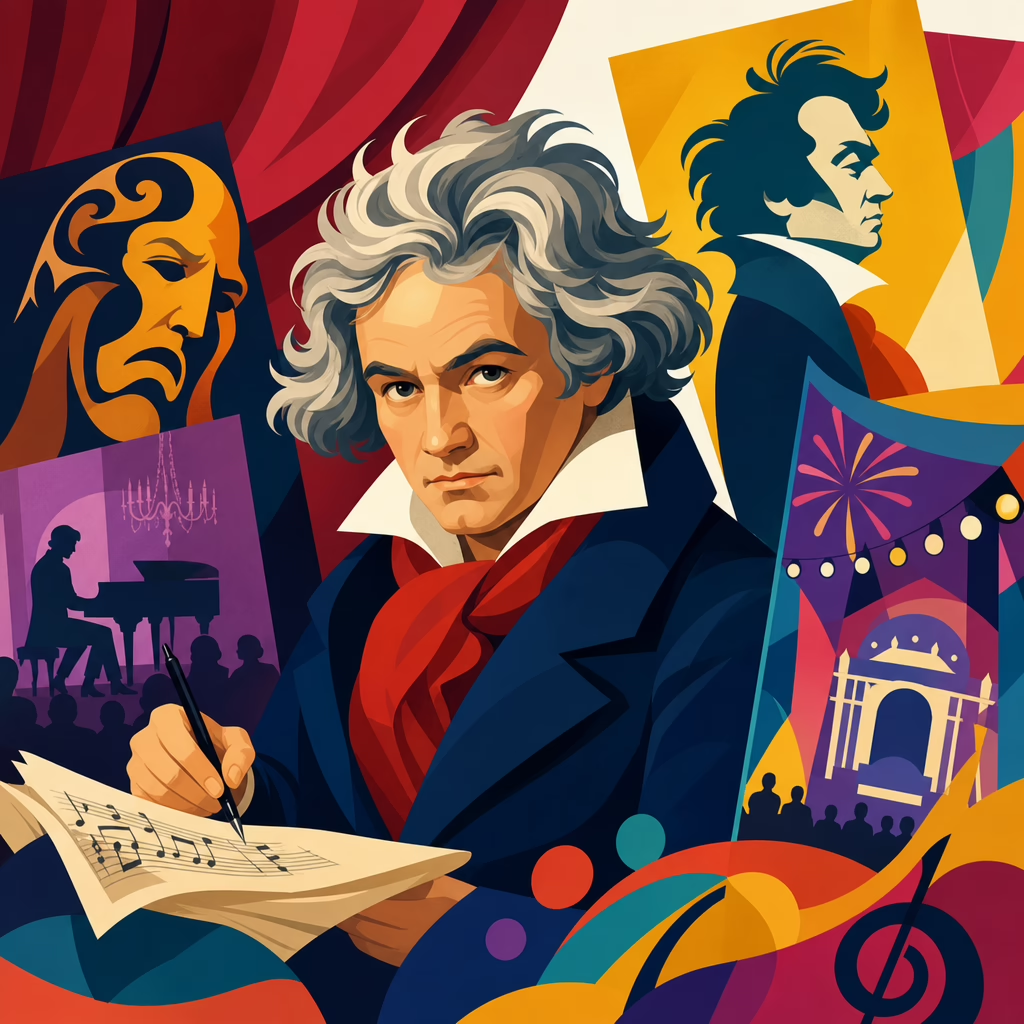
Beethoven in Theater Posters and Festival Branding
Beethoven appears on theater posters and festival branding because his image carries instant cultural meaning: artistic seriousness, emotional intensity, and a promise of endurance across generations. In practical design terms, “theater posters” are promotional graphics for staged performances, concert seasons, and touring productions, while “festival branding” includes the visual system that unifies programs, tickets, websites, signage, merchandise, and sponsor materials. When organizers choose Beethoven as a central motif, they are not merely decorating an event with a famous face. They are activating a dense network of associations tied to genius, revolution, struggle, prestige, and public memory.
I have worked with arts marketing teams on season campaigns, and Beethoven is one of the few classical figures whose visual identity can travel across formats without losing recognition. A cropped profile from a nineteenth-century portrait, a fragment of manuscript with explosive notation, or even a typographic treatment of the name “Beethoven” can communicate scale and ambition before a viewer reads the event details. That is rare. Many composers are musically revered but visually weak in marketing. Beethoven is different because the brand assets are already embedded in popular culture: the unruly hair, the stern gaze, the heroic mythology, and the immediate recall of the Fifth and Ninth Symphonies.
This matters because poster design and festival identity do real strategic work. They shape audience expectations, justify ticket prices, attract sponsors, and help institutions distinguish one commemorative season from another. A Beethoven festival competes not only with other arts events but with every demand on public attention. Strong branding must therefore answer clear questions fast: Is this event traditional or contemporary? Scholarly or accessible? Civic, political, celebratory, or experimental? Beethoven’s iconography can support any of those positions, but only if designers understand the history and use it deliberately.
The most effective Beethoven branding succeeds when it balances reverence with legibility, historical texture with modern production needs, and symbolism with practical communication. Poor executions reduce him to cliché. Strong ones convert centuries of cultural capital into a coherent visual language that audiences recognize immediately and remember long after the performance ends.
The visual vocabulary that made Beethoven a poster icon
Beethoven became unusually adaptable to poster culture because his public image was standardized early through portraits, busts, engravings, and later photographic reproductions of those works. Joseph Karl Stieler’s 1820 portrait is the dominant source in modern branding: Beethoven holds the Missa solemnis manuscript, hair charged upward, expression focused and combative. Designers return to it because it offers more than likeness. It encodes authorship, intensity, and monumental purpose in a single frame. Even when reduced to high-contrast black and white or converted into vector outlines, the portrait remains legible at distance.
Another durable asset is Beethoven’s handwriting. His manuscripts are not neat decorative calligraphy; they look urgent, revised, pressured by thought. On posters, manuscript fragments suggest process and genius at once. A branding system may overlay score excerpts beneath event listings, use note clusters as background texture, or animate scribal marks for digital screens. This works especially well for festivals that want to emphasize creation, experimentation, or the unfinished energy of live performance rather than museum-like commemoration.
The visual vocabulary also includes objects associated with nineteenth-century musical authority: quills, folios, pianos, conductor silhouettes, and architectural references to concert halls and civic monuments. In weaker campaigns these become generic. In stronger ones they are tightly edited and paired with clear hierarchy. For example, a poster for a Beethoven string quartet cycle might avoid the overused portrait entirely and instead feature enlarged manuscript bars from Op. 131, set against a restrained palette of ivory, charcoal, and oxide red. Viewers still understand the Beethoven signal, but the design feels specific rather than ceremonial.
That specificity is what turns iconography into branding. The goal is not simply to show Beethoven; it is to decide which Beethoven is being presented: the revolutionary, the humanist, the political symbol, the deaf creator, or the canonical master. Each choice affects typography, color, photography, and copy.
How festivals build a complete Beethoven identity across formats
Festival branding is more demanding than a single poster because it must remain coherent across months of communication and many audience touchpoints. In practice, a Beethoven festival identity usually begins with a core visual thesis. One campaign may center on heroic monumentality, using large serif type, stone-like textures, and portrait crops that mimic carved busts. Another may stress living relevance, using fluorescent accents, modular grids, and animated score fragments. The success measure is not whether every asset looks identical, but whether every asset feels unmistakably part of one system.
When I review arts campaigns, the strongest systems define five things early: image source, type hierarchy, color palette, motion behavior, and rules for partner logos. Beethoven anniversaries make these decisions harder because institutions often collaborate across orchestras, museums, universities, and city governments. Without strict rules, the identity fragments quickly. A city banner may look formal, a social ad may look pop, and a print brochure may slide into academic clutter. Good branding prevents that drift through templates and usage standards.
Festival identity must also handle range. Beethoven programming often includes symphonies, chamber music, lectures, school events, film screenings, and site-specific performances. One master mark cannot carry all that meaning alone. Sub-brands or program labels are often necessary, but they should inherit the same visual DNA. A practical example is using one headline font for all materials, while changing accent colors by program stream: gold for orchestral works, blue for education, crimson for opera, slate for talks. Audiences then navigate complexity without losing the central brand.
For a broader context on why this composer commands such durable symbolic power across media, see this guide to why Beethoven became a global cultural icon. That wider reputation is exactly what poster designers and festival directors are drawing on when they put his name or face at the center of public campaigns.
Common design strategies and what they communicate
Not every Beethoven poster says the same thing. Certain repeatable strategies appear across theaters and festivals because they solve recurring communication problems. The table below shows how major approaches function in real branding work.
| Design strategy | Typical visual choices | Message sent to audiences | Best use case |
|---|---|---|---|
| Heroic portrait | Stieler-inspired face crop, dark background, serif typography | This is a major, prestigious, canonical event | Symphony cycles, gala openings, anniversary seasons |
| Manuscript-driven design | Score textures, marginal edits, layered notation, restrained palette | Focus on creative process and musical depth | Chamber festivals, scholarly series, composer labs |
| Minimal typographic branding | Large surname, clean grid, little or no portrait | Beethoven is current, adaptable, and intellectually confident | Urban festivals, crossover programming, younger audiences |
| Pop reinterpretation | Bold color blocks, collage, illustrated hair silhouette, neon accents | This event connects classical music to contemporary culture | Outdoor festivals, student outreach, multidisciplinary events |
The heroic portrait remains effective because it simplifies the sales message. Audiences immediately understand importance. The downside is predictability. If every institution uses the same stern face, the campaign can feel interchangeable. Manuscript-based design offers more originality and often aligns better with educational or exploratory programming, but it requires stronger typography because notation alone is not always readable from a distance.
Minimal typographic branding has grown in the last decade, especially where institutions want to avoid the museum effect. A poster that simply sets BEETHOVEN in oversized type, supported by exact repertoire and dates, can feel more contemporary than another varnished oil-painting treatment. Pop reinterpretations are riskier but can succeed when the event itself is genuinely cross-genre. If the visuals promise disruption and the programming is conservative, audiences notice the mismatch immediately.
National identity, anniversaries, and civic messaging
Beethoven branding often expands beyond arts marketing into civic symbolism. Major anniversaries, especially the 250th in 2020, showed how cities and cultural ministries use Beethoven to project heritage, resilience, and international relevance. Bonn, his birthplace, leaned heavily on civic ownership, while global institutions framed him as a transnational figure belonging to world culture. Those are different branding positions. One roots Beethoven in place; the other turns him into a portable emblem of shared human aspiration.
This distinction shapes poster language. A city-led festival may incorporate local landmarks, municipal colors, or historical maps to connect Beethoven to urban identity and tourism. An international festival is more likely to emphasize universality through abstract forms, multilingual typography, or references to the “Ode to Joy” as a global anthem. Both approaches can work, but they target different emotional triggers. Civic campaigns sell belonging. International campaigns sell significance and reach.
Anniversary branding also introduces a recurring tension between celebration and overproduction. During commemorative years, the market fills with Beethoven imagery, and sameness becomes a real problem. The organizations that stand out are usually those that define a narrow interpretive angle. Instead of “Beethoven the genius” in general, they focus on Beethoven and freedom, Beethoven and deafness, Beethoven and political change, or Beethoven in dialogue with contemporary composers. Poster design then serves a clear editorial thesis rather than a generic tribute.
There is also a governance issue. Publicly funded festivals often need branding that satisfies curators, educators, tourism officials, and sponsors at the same time. That pressure can flatten the design. The best teams protect a few nonnegotiables: consistent headline treatment, a recognizable anchor image, and plain-language event labeling. Without those basics, even historically rich campaigns become visually noisy and harder to trust.
What makes Beethoven branding effective today
Effective Beethoven branding today is not about looking old; it is about converting historical authority into present-tense clarity. Audiences decide within seconds whether a poster feels inviting, elitist, confusing, or compelling. The best campaigns respect the source material but do not become trapped by it. They scan well on a phone, print cleanly on street formats, and maintain hierarchy when translated into ticketing platforms, social assets, and venue signage.
From experience, three practical rules matter most. First, choose one central symbol and let it work hard. If you use the portrait, do not also crowd the layout with piano keys, statues, and handwritten notes. Second, pair emotion with information. Beethoven branding can be dramatic, but dates, venue, repertoire, and booking path must remain immediate. Third, make the visual promise match the program. If the poster signals radical reinterpretation, the event should genuinely offer a fresh listening frame, whether through staging, contextual talks, or repertoire juxtapositions.
Accessibility matters as well. High-contrast text, readable type sizes, and disciplined hierarchy are not optional refinements; they are central to audience growth. Many classical campaigns still underperform because they privilege atmosphere over usability. Theater posters are not gallery pieces. Their job is to communicate and persuade in busy public space. The same principle applies to festival branding across websites and mobile ticket flows.
Beethoven remains one of the strongest cultural figures available to arts marketers because his visual and symbolic assets are unusually rich. Yet that strength only pays off when institutions move beyond default reverence. The most memorable theater posters and festival identities decide exactly which Beethoven they mean, build a disciplined system around that choice, and carry it consistently from the first street banner to the final program note. If you are shaping a Beethoven campaign, start with the story you want audiences to feel, then design every visual element to tell that story clearly.
Frequently Asked Questions
Why does Beethoven appear so often in theater posters and festival branding?
Beethoven appears so often in theater posters and festival branding because his image communicates meaning immediately, even before a viewer reads a single line of text. Organizers and designers rely on him as a cultural shorthand for artistic seriousness, emotional depth, and creative endurance. His face, silhouette, or even just his distinctive hair and stern expression can signal that an event belongs to the world of major classical music, ambitious performance, and lasting cultural value. In crowded promotional environments, that kind of instant recognition matters. A poster has only a few seconds to make an impression, and Beethoven helps establish tone quickly and memorably.
He also works especially well across different parts of a visual campaign. Theater posters are usually designed to sell a specific performance, season, or touring production, while festival branding has to function as a broader system across programs, tickets, websites, signage, merchandise, and sponsor materials. Beethoven’s image can anchor both needs at once. It can carry the prestige of the event on a large street poster while remaining flexible enough to appear as an icon, motif, or visual reference in digital graphics, stage banners, and printed collateral. That adaptability is a major reason arts organizations continue to return to him.
There is also a historical and emotional layer. Beethoven is not just famous; he is associated with struggle, genius, transformation, and music that has outlived generations. That gives designers and marketers a rich symbolic vocabulary to work with. Whether the event wants to emphasize grandeur, rebellion, human resilience, or canonical excellence, Beethoven can support that message. In branding terms, he offers both recognition and narrative, which is a rare and valuable combination.
What is the difference between Beethoven on a theater poster and Beethoven in festival branding?
The difference comes down to purpose, scope, and consistency. A theater poster is usually a single promotional piece created to attract attention for one production, one concert, or one run of performances. Its job is immediate: stop the viewer, communicate the event, and persuade someone to learn more or buy a ticket. When Beethoven appears on a theater poster, he often functions as the central visual hook. His portrait may dominate the composition, or his likeness may be stylized to create a strong emotional atmosphere that supports the title, venue, and dates.
Festival branding, by contrast, is not one image but a full visual system. It includes the design language that connects programs, tickets, websites, social media graphics, signs, merchandise, sponsor decks, maps, and on-site materials. In that context, Beethoven is used less as a one-time image and more as a unifying identity element. He may appear as a recurring portrait treatment, a custom illustration, a typographic pairing, a repeated silhouette, or a motif woven into the broader graphic system. The goal is not only recognition but coherence across many touchpoints and formats.
That means the design decisions are different. A poster can be more singular, dramatic, and event-specific. Festival branding has to be scalable, adaptable, and durable over the length of the campaign. It must work on a phone screen, a banner outside a venue, a printed booklet, and a tote bag without losing clarity. If Beethoven is part of that system, the branding team has to think beyond immediate impact and consider usability, repetition, audience consistency, and long-term brand memory. In short, posters sell moments, while festival branding builds an identity, and Beethoven can serve both roles in different ways.
What does Beethoven’s image communicate to audiences in a promotional design?
Beethoven’s image communicates a layered set of messages that audiences often understand instinctively. First, it suggests artistic authority. Even people with limited knowledge of classical music typically recognize Beethoven as one of its defining figures, so his presence signals that the event takes its artistic mission seriously. That can be especially useful for theaters, orchestras, and festivals that want to present themselves as credible, high-caliber institutions. His image can elevate the perceived stature of a production or season without requiring lengthy explanation.
Second, he conveys emotional intensity. Beethoven is widely associated not only with fame but with powerful feeling: drama, conflict, triumph, longing, and human struggle. Designers often use that association to frame an event as more than polite entertainment. A poster featuring Beethoven can imply urgency, passion, and depth, helping audiences expect an experience that is intellectually and emotionally substantial. This is one reason his image remains effective beyond traditional symphonic settings, including theater, cross-disciplinary festivals, and contemporary reinterpretations of classical themes.
Third, Beethoven communicates endurance and intergenerational relevance. His music and cultural presence have lasted for centuries, so using him in branding can suggest continuity, tradition, and lasting value. For festivals, that is especially powerful because branding often needs to reassure sponsors, patrons, and attendees that the event has substance as well as excitement. At the same time, modern designers can reinterpret Beethoven in bold, graphic, or unconventional ways to show that tradition is still alive and adaptable. That balance between legacy and reinvention is one of the strongest messages his image can carry in promotional design.
How do designers use Beethoven visually without making posters or branding feel outdated?
Designers keep Beethoven from feeling outdated by treating him as a flexible visual symbol rather than a fixed museum image. Instead of simply reproducing a familiar painted portrait, they often reinterpret his likeness through cropping, abstraction, illustration, collage, color treatments, typography, or contemporary photography-inspired layouts. A close-up of his expression, a silhouette built from musical notation, or a high-contrast graphic rendering can preserve recognition while creating a fresh visual language. The key is to retain the cultural signal of Beethoven while presenting it in a way that feels current to today’s audiences.
Typography and layout also play a major role. Even when the source image is historical, the surrounding design system can be unmistakably modern. Clean grid structures, bold sans-serif type, restrained color palettes, kinetic compositions, and digital-first adaptations can position Beethoven within a contemporary brand environment. This is especially important in festival branding, where the identity must move fluidly across websites, social media assets, mobile screens, wayfinding signs, and printed materials. A modern system can make a centuries-old figure feel immediate rather than distant.
Perhaps most importantly, successful designers connect the image to a clear concept. If Beethoven is used only as a generic symbol of classical music, the result can feel predictable. But when his image supports a specific message—such as innovation within tradition, emotional extremity, civic pride, artistic resilience, or the reinvention of a canon—the branding gains purpose and freshness. In other words, what keeps Beethoven contemporary is not just visual styling but conceptual relevance. Audiences respond best when the design shows why Beethoven belongs to this event, this season, or this festival right now.
Why is Beethoven especially effective for branding that has to work across posters, tickets, websites, signage, and merchandise?
Beethoven is especially effective in multi-platform branding because he combines instant recognition with visual adaptability. A strong branding system needs elements that can appear at different sizes, in different formats, and in different levels of detail without losing meaning. Beethoven’s face and silhouette are distinctive enough to work in many forms: a full poster portrait, a simplified icon on a ticket, a cropped banner image on a website, a line drawing on merchandise, or a repeated motif in environmental signage. Few cultural figures offer that same level of recognizability across so many applications.
He also helps create consistency across the audience journey. Festival branding is not limited to one advertisement; it has to unify every point of contact, from the first social media impression to the program booklet and on-site experience. When Beethoven is used effectively, he becomes a visual thread connecting all those materials. That consistency strengthens brand memory and gives the event a cohesive public identity. Audiences may encounter the branding in fragments, but the recurring image helps them understand that all those pieces belong to one curated artistic experience.
From a strategic perspective, Beethoven also supports communication with multiple stakeholders at once. Attendees may read him as a promise of quality and emotional depth. Sponsors may see cultural prestige and institutional seriousness. Media outlets may find the imagery immediately legible and newsworthy. Merchandise buyers may respond to his iconic visual presence even outside the event itself. Because festival branding must satisfy artistic, practical, and promotional goals simultaneously, Beethoven offers unusual efficiency: he is symbolic, marketable, and system-friendly all at once. That is why he remains such a durable choice in theater and festival design.